
Workbench
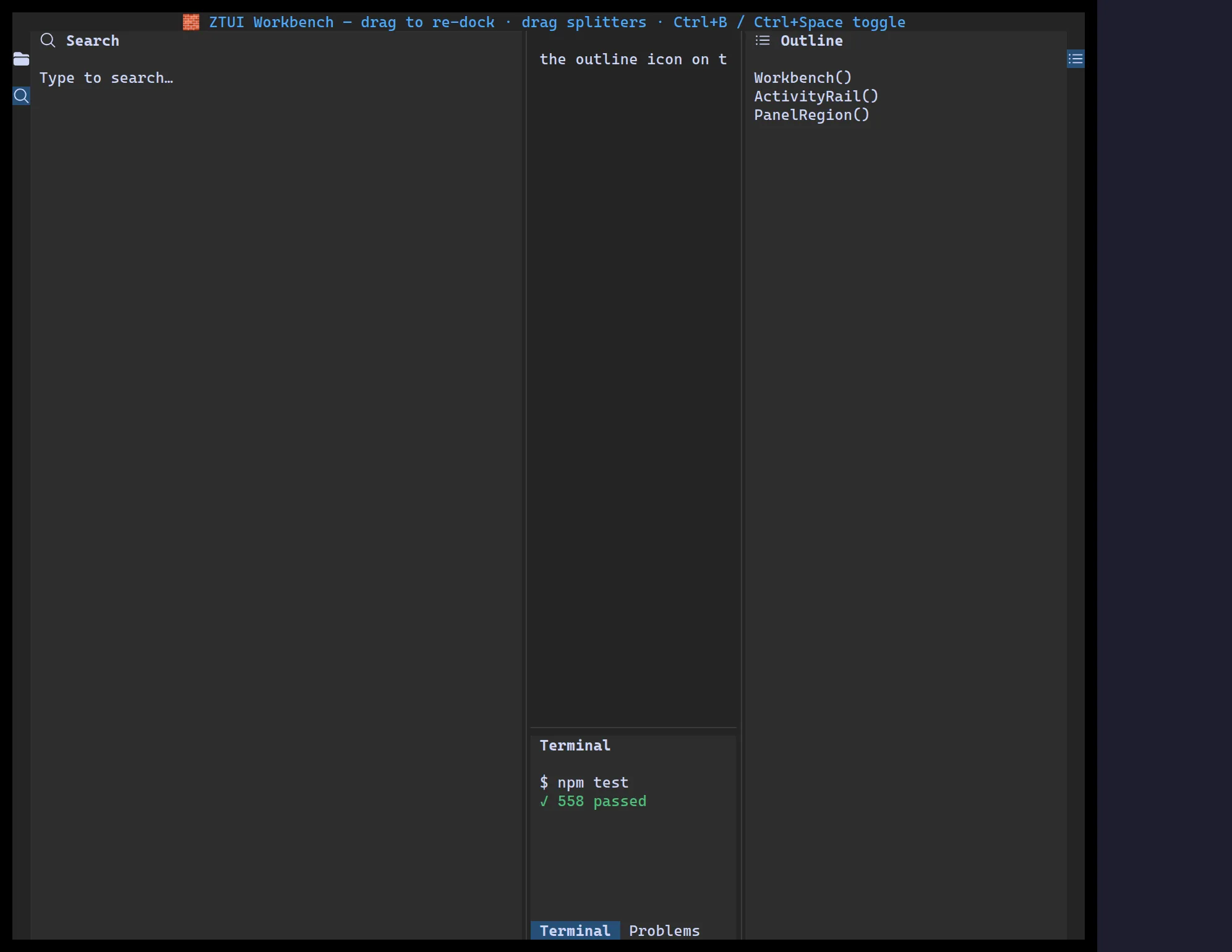
<Workbench> is a full IDE-style shell: hideable left/right/bottom panels driven
by an activity rail, draggable splitters, drag-to-re-dock, and a serializable
layout you can persist and restore.
import { Label, Workbench } from "@huyz0/ztui/react";
<Workbench  panels={[    { id: "search", anchor: "left", title: "Search", icon: "magnifying-glass", content: <Label>…</Label> },    { id: "outline", anchor: "right", title: "Outline", icon: "list-bullet", content: <Label>…</Label> },    { id: "terminal", anchor: "bottom", title: "Terminal", content: <Label>$ npm test</Label> },  ]}  initialOpen={["left", "bottom"]}  onLayoutChange={(layout) => savePrefs(layout)}>  <Label>Editor area (children fill the center)</Label></Workbench>;
Key props
Section titled “Key props”panels—{ id, anchor: "left" | "right" | "bottom", title, icon?, content }[].children— the center/editor content.initialOpen/initialSizes— which regions start open and at what size.initialLayout/onLayoutChange— restore and persist a serializable snapshot.toggleKeys— per-region toggle keybindings (defaults:Ctrl+B,Ctrl+Alt+B,Ctrl+Space).