
Model Picker
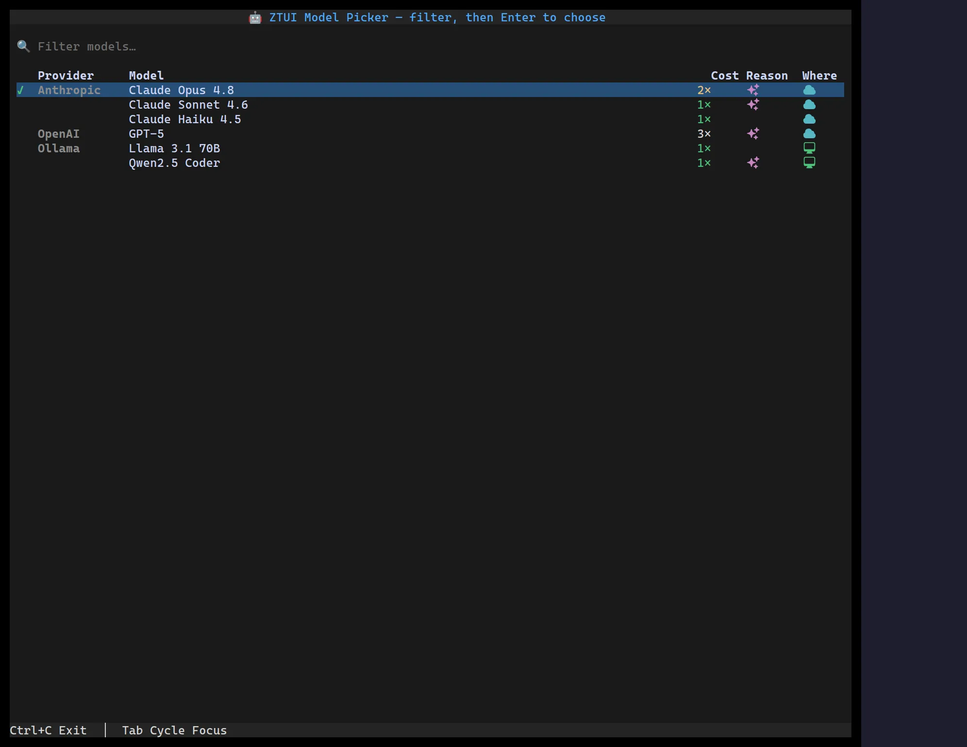
<ModelPicker> is a filterable table list for choosing an LLM. Each row shows
the provider, the model name, a cost multiplier badge (coloured by
magnitude), a reasoning icon, and a local/remote icon (icons, not text).
Type in the filter to narrow the rows; arrow-navigate and press Enter (or
double-click) to choose. It’s built on Table,
Input, and HeroIcon.
import { useState } from "react";import { ModelPicker } from "@huyz0/ztui/react";import type { ModelEntry } from "@huyz0/ztui/react";
const MODELS: ModelEntry[] = [  { id: "opus", provider: "Anthropic", name: "Claude Opus 4.8", cost: 2, reasoning: true, location: "remote" },  { id: "haiku", provider: "Anthropic", name: "Claude Haiku 4.5", cost: 1, location: "remote" },  { id: "gpt5", provider: "OpenAI", name: "GPT-5", cost: "3×", reasoning: true, location: "remote" },  { id: "llama", provider: "Ollama", name: "Llama 3.1 70B", cost: 1, location: "local" },];
function Picker() {  const [id, setId] = useState("opus");  return <ModelPicker models={MODELS} value={id} onSelect={(m) => setId(m.id)} />;}
A model entry
Section titled “A model entry”interface ModelEntry { id: string; // stable id; the committed selection matches on this name: string; // "Claude Opus 4.8" provider?: string; // "Anthropic" cost?: number | string; // 1 → "1×", 2 → "2×" (coloured), or a custom string ("3×", "$3/Mtok") reasoning?: boolean; // shows a reasoning icon location?: "local" | "remote"; // shows a local/remote icon instead of text}A numeric cost renders as a multiplier badge tinted by magnitude (≤1
green, 2 amber, more red); a string renders verbatim for custom pricing.
Columns appear only when at least one model supplies that field, so a list
of bare { id, name } entries renders as a plain name list.
Key props
Section titled “Key props”models— the entries to choose from.value— the selected model id (marked with a ✓).onSelect(model)— fired when a row is chosen (Enter / double-click).filterable— show the text filter box (defaulttrue);filterPlaceholdersets its hint andfilterFieldspicks which fields it matches (default name + provider).groupByProvider— group rows by provider with the provider name shown once (bold) at the head of each run (defaulttrue).icons— override the icon-column glyphs:{ local, remote, reasoning }(Heroicon names; defaultscomputer-desktop/cloud/sparkles).extraColumns— append your ownTableColumns after the built-ins, so the picker stays composable.
Pairing with the composer
Section titled “Pairing with the composer”Drop a ModelPicker in a popover or panel and open it from a
Conversation — e.g. a /model command in the
composer, or a model badge in the conversation’s hintTrailing slot that opens
the picker on click.