
Button Group
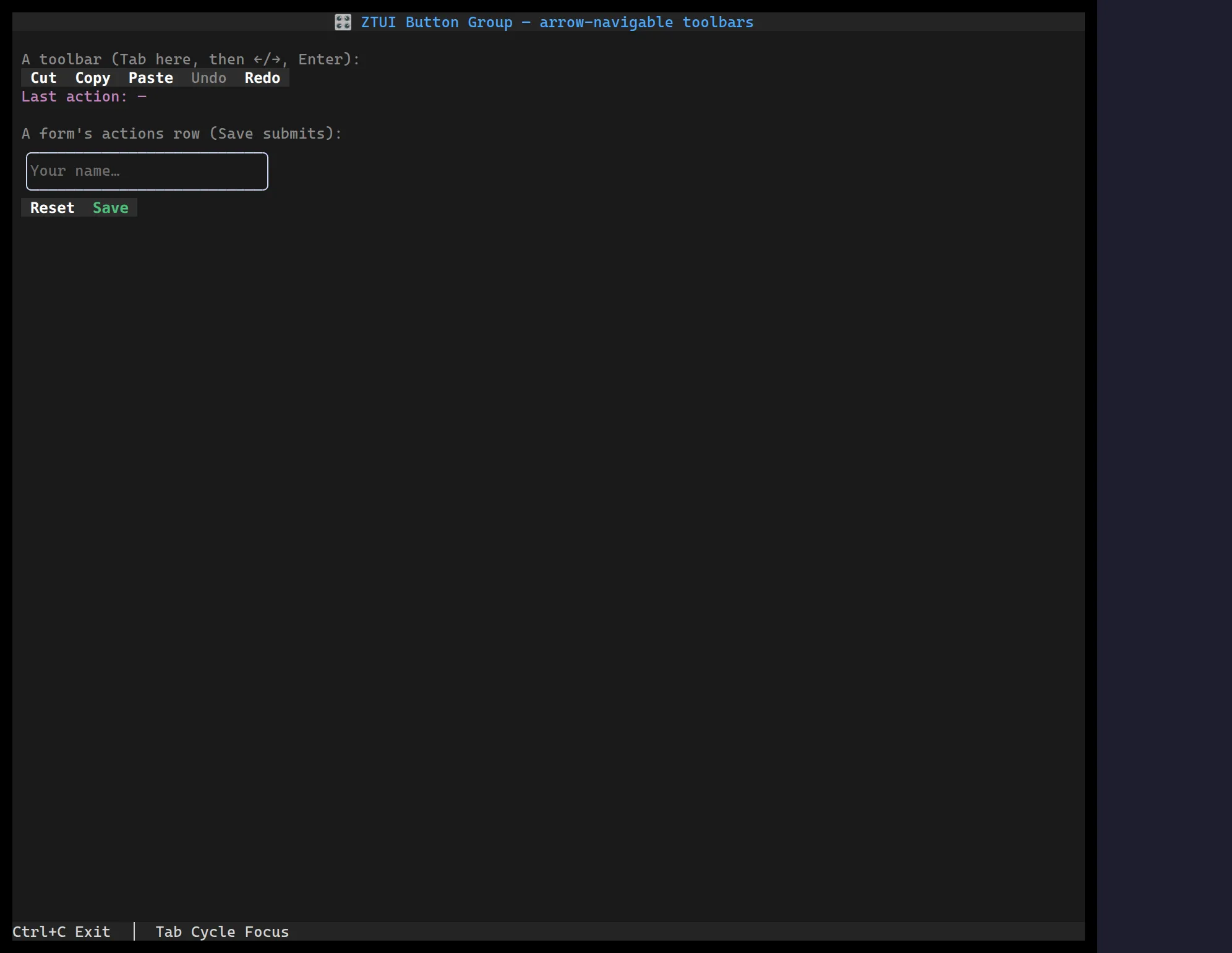
<ButtonGroup> turns a row of Buttons into a
roving-focus toolbar: arrow keys (←/→/↑/↓, plus Home/End) move
focus between the buttons, and the whole group is a single Tab stop — so the
actions read as one control instead of N separate tab stops. Disabled buttons are
skipped.
Each child is a real Button, so it keeps its own onClick, focus glow, and
formAction — the group only owns navigation. That means a group of formAction
buttons dropped into a Form is an arrow-navigable
actions row that still submits or resets the form on Enter.
import { Button, ButtonGroup } from "@huyz0/ztui/react";
<ButtonGroup>  <Button onClick={cut}>Cut</Button>  <Button onClick={copy}>Copy</Button>  <Button onClick={paste}>Paste</Button>  <Button disabled>Undo</Button>  <Button onClick={redo}>Redo</Button></ButtonGroup>;
Inside a form
Section titled “Inside a form”<Form onSubmit={save}> <Input id="name" /> <ButtonGroup> <Button formAction="reset">Reset</Button> <Button formAction="submit" style={{ color: "$success" }}>Save</Button> </ButtonGroup></Form>Tab moves through the fields, lands on the group as one stop, ←/→ pick the
action, and Enter on Save submits (validating the form first) — no extra
wiring.
Key props
Section titled “Key props”children— theButtons to navigate between.orientation—"horizontal"(default) or"vertical"; sets the layout direction. Arrows work on both axes regardless, matching a radio group.wrap— wrap around at the ends instead of stopping (defaulttrue).
How it works
Section titled “How it works”The group is not itself a focus target — each frame it leaves only the active
button focusable, so the screen’s tab order has exactly one entry for the group.
Arrow keys arrive by bubbling up from the focused button (whose own key handler
ignores them) and move focus to the previous/next enabled button. This mirrors
the RadioGroup roving-selection model, but over
real buttons so activation, theming, and form behaviour stay native.