
Conversation
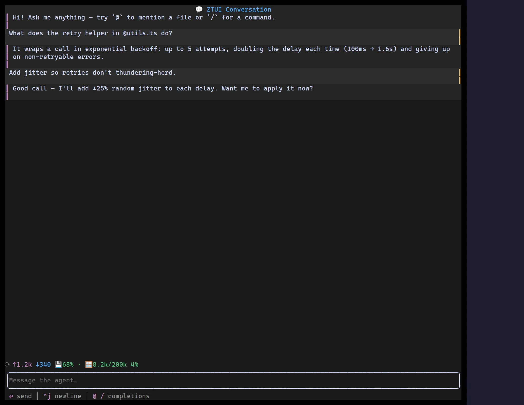
<Conversation> is the shell that ties the Agent Kit together: a tail-following
Transcript of turns (its children) with a docked
ChatInput composer beneath them. It owns the
layout and the submit / interrupt / busy / hint-line wiring, so your app
only supplies the turns and a few handlers — no manual hint state, spacer rows,
or scroll plumbing.
It is stateless by design: your app keeps the message list and the busy
flag; Conversation just lays them out and routes events. That mirrors how
ChatInput owns only its draft buffer, and keeps the component compatible with
any state-management approach.
import { useState } from "react";import { ChatBubble, Conversation, UsageMeter } from "@huyz0/ztui/react";
function Agent() {  const [turns, setTurns] = useState<{ id: number; role: "user" | "assistant"; text: string }[]>([]);  const [busy, setBusy] = useState(false);
  return (    <Conversation      busy={busy}      placeholder="Message the agent…"      composer={{ triggers: [mention, slash] }}      footer={<UsageMeter variant="compact" turn={turn} contextSize={200_000} contextUsed={used} />}      onSubmit={(text) => {        setTurns((t) => [...t, { id: next(), role: "user", text }]);        setBusy(true); // …kick off the turn, append the reply, clear busy      }}      onInterrupt={() => setBusy(false)}    >      {turns.map((t) => (        <ChatBubble key={t.id} role={t.role}>          {t.text}        </ChatBubble>      ))}    </Conversation>  );}
Key props
Section titled “Key props”children— the turns, rendered inside the transcript (ChatBubble,ToolRender,Reasoning, anything).busy/onInterrupt— drive the composer’s in-border stop affordance; Esc or the stop glyph callsonInterrupt.onSubmit(value, attachments)— called when the user sends a turn.placeholder— composer placeholder.composer— the long tail ofChatInputprops (triggers, commands, history, ghost-text suggestions, chip serialization). The top-levelplaceholder/busy/onSubmit/onInterruptwin over the same keys here.header/footer— optional regions above the transcript and between the transcript and the composer (e.g. a title bar and aUsageMeter).followTail— pin to the newest turn until the user scrolls up (defaulttrue).readOnly— hide the composer for an archived, read-only transcript view.showHints/extraHints— auto-render the composer’s contextual hint line (on by default);Conversationtracks the hints itself.hintLeading/hintTrailing— slots on the same row as the hint line, pinned left and right of the auto hints (a1frspacer pushes the trailing one to the edge). Use them for a status glyph or connectionPillon the left and a model badge,UsageMeter, or token-rate readout on the right.
Conversation is a composition shell — every region is a slot you fill:
| Slot | Where | Typical content |
|---|---|---|
header | above the transcript | title bar, a model/mode picker |
children | the transcript | ChatBubble / ToolRender / Reasoning turns |
footer | between transcript and composer | a UsageMeter, a status HBox |
composer | the docked ChatInput | triggers, commands, history, suggestions |
hintLeading / hintTrailing | the hint row (bottom) | status glyph · model badge / metrics |
The footer and the two hint* slots take arbitrary nodes, so a left/right
split is just an HBox with a width: "1fr" spacer between the two sides.
Transcript
Section titled “Transcript”<Transcript> is the scrollback on its own: a vertical, tail-following
scroll region that pins to the latest turn as content streams in, until the user
scrolls up to read history (and re-pins when they return to the bottom). It is
vertical-scroll only, so long messages word-wrap to the viewport instead of
overflowing. Conversation renders one internally, but you can use it directly
for a custom layout.
<Transcript style={{ height: "1fr" }}> <ChatBubble role="user">…</ChatBubble> <ChatBubble role="assistant">…</ChatBubble></Transcript>