
Description List
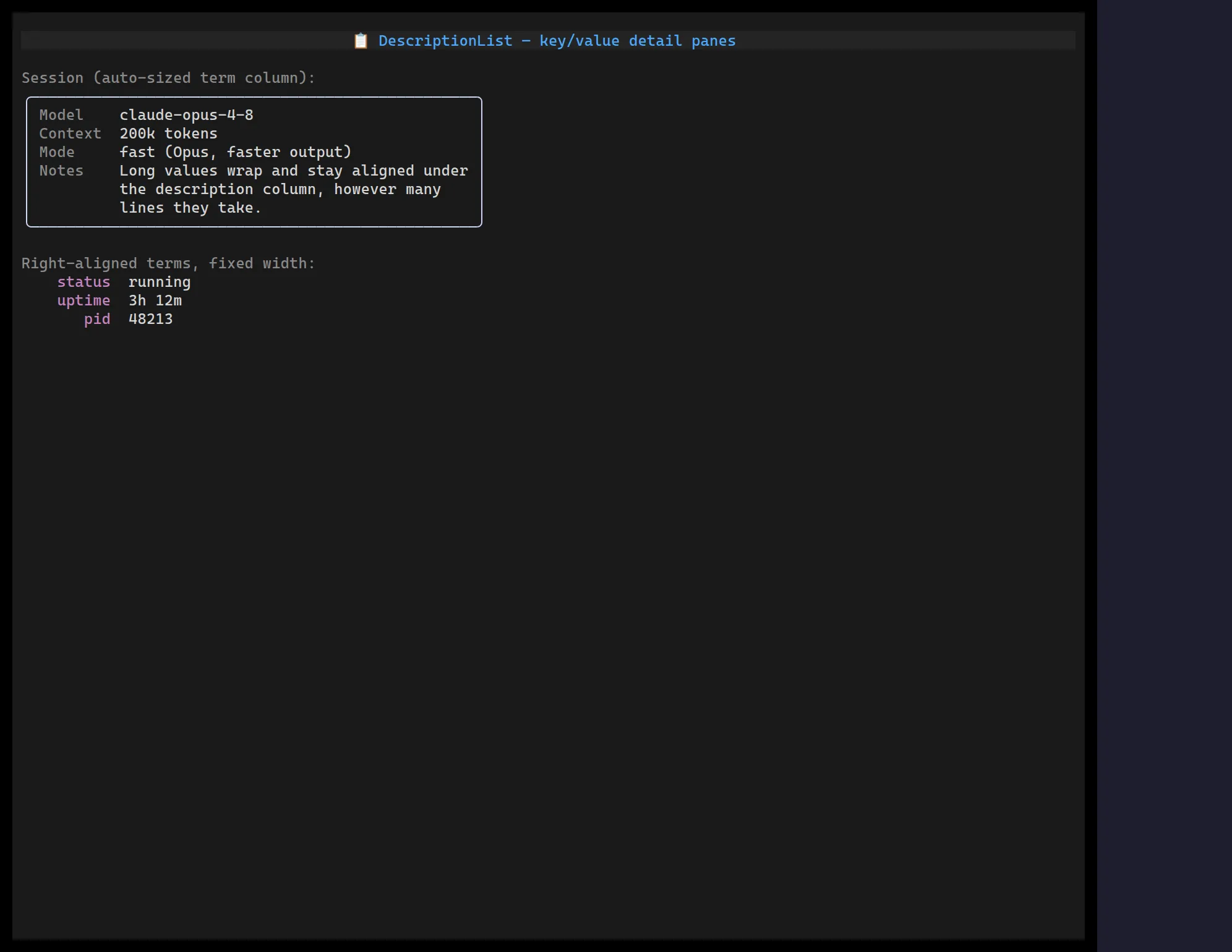
<DescriptionList> is a two-column term : description list — the terminal
analogue of an HTML <dl> — for config dumps, key/value detail panes, and
metadata summaries. Terms share one auto-sized (or fixed) left column;
descriptions fill the rest and word-wrap, with continuation lines aligned under
the description column.
import { DescriptionList } from "@huyz0/ztui/react";
<DescriptionList  items={[    { term: "Model", description: "claude-opus-4-8" },    { term: "Context", description: "200k tokens" },    { term: "Notes", description: "Long values wrap and stay aligned." },  ]}/>;
Key props
Section titled “Key props”items—{ term, description }[], the rows.termWidth— fix the term-column width; when unset it auto-sizes to the widest term (capped at 24).gap— cells between the columns (default 2).termAlign—"left" | "right"(defaultleft).termColor— term colour (default$dimmed); the value usesstyle.color(default$foreground).
It caps and truncates the term, wraps the description to whatever width remains, and clips rows that don’t fit.