
Selection List
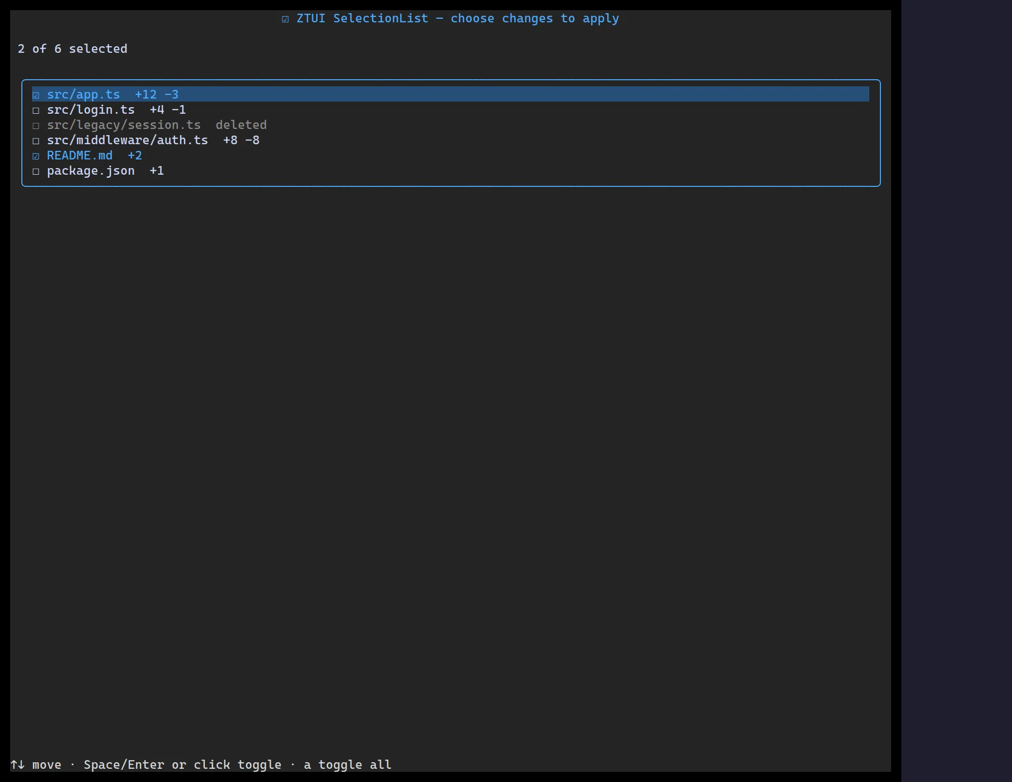
<SelectionList> is a multi-select checklist: a moving cursor plus per-row
checked state, controlled or uncontrolled.
import { SelectionList } from "@huyz0/ztui/react";
const items = [  { id: "ts", label: "TypeScript" },  { id: "rs", label: "Rust" },  { id: "go", label: "Go" },];
<SelectionList  items={items}  defaultValue={["ts"]}  onChange={(ids) => console.log("checked", ids)}/>;
Key props
Section titled “Key props”items—ListItem[].value/defaultValue— selected ids (controlled or initial).onChange— fired with the new array of checked ids.glyphSet— customize the checked/unchecked/cursor glyphs.
Interaction
Section titled “Interaction”↑/↓ move the cursor · Space/Enter toggles the row · a toggles all.