
Button
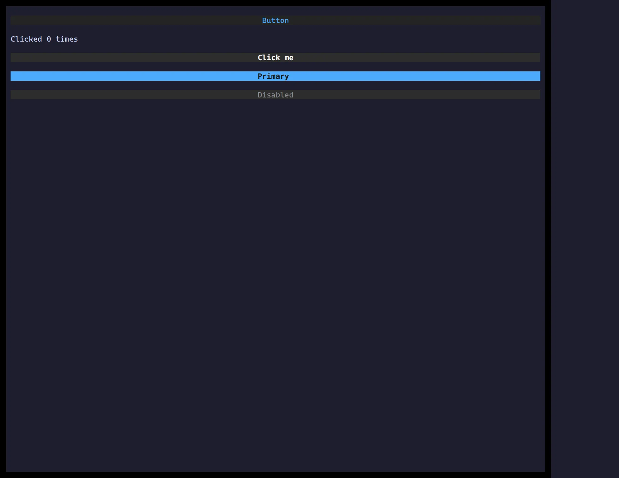
<Button> is a focusable control that fires onClick on Enter/Space or a
mouse click. Style it like any widget; pair it with a Form via formAction.
import { useState } from "react";import { Button } from "@huyz0/ztui/react";
function Counter() {  const [n, setN] = useState(0);  return (    <Button onClick={() => setN(n + 1)} style={{ background: "$primary", color: "$background" }}>      Clicked {n}×    </Button>  );}
Key props
Section titled “Key props”onClick— fired on click orEnter/Spacewhen focused.formAction—"submit"|"reset"to drive an enclosing Form.disabled— inert + muted styling.