
HeroIcon
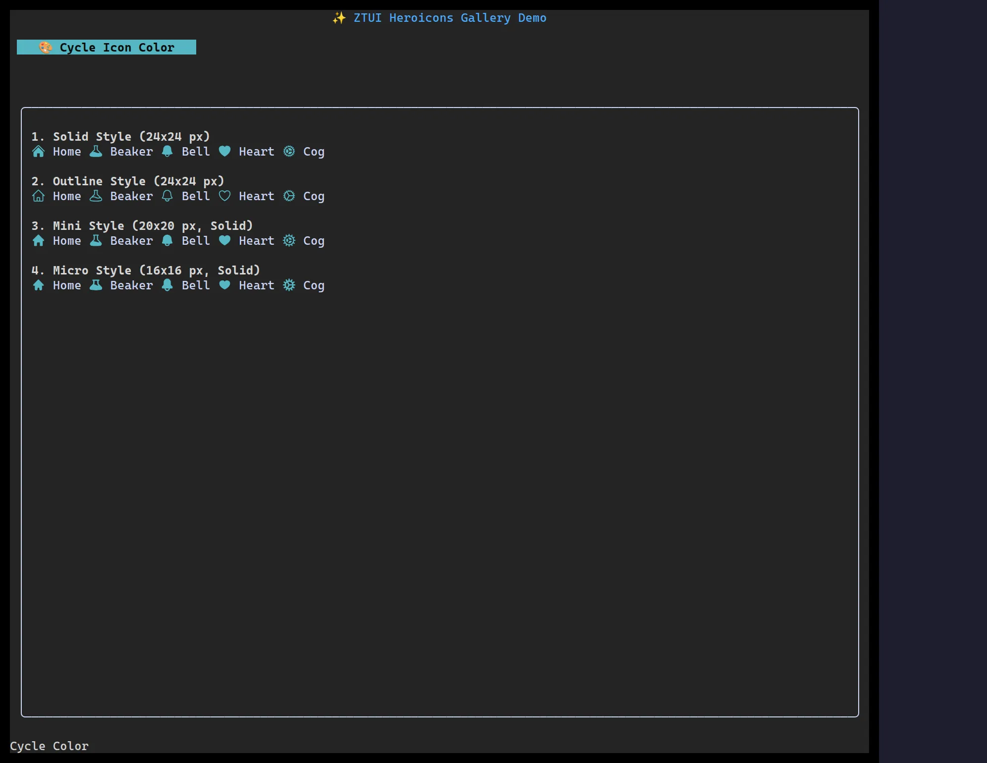
<HeroIcon> draws an icon from the Heroicons set. On the
terminal it rasterizes the SVG to the best graphics protocol (Kitty / iTerm2 /
Sixel); on the web/canvas backend it renders the SVG natively (the browser
rasterizes it at the device pixel ratio). currentColor is tinted to the icon’s
color, so icons follow your theme.
import { HBox, HeroIcon } from "@huyz0/ztui/react";
<HBox>  <HeroIcon name="home" variant="solid" style={{ color: "$primary" }} />  <HeroIcon name="bell" variant="outline" style={{ color: "yellow" }} />  <HeroIcon name="heart" variant="mini" style={{ color: "red" }} /></HBox>;
Key props
Section titled “Key props”name— the Heroicon name (e.g."home","academic-cap","beaker").variant—"solid"|"outline"|"mini"|"micro"(default"solid").style.color— tints the icon (viacurrentColor).