
Markdown
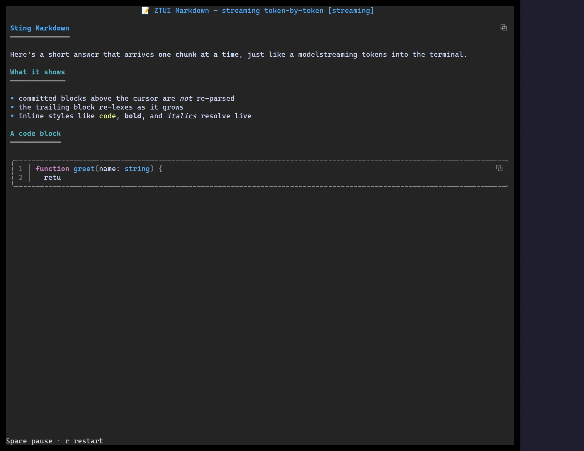
<Markdown> renders Markdown to styled widgets. Fenced code blocks are
syntax-highlighted (with @huyz0/ztui/syntax), ```mermaid blocks render as diagrams
(with @huyz0/ztui/mermaid), and incremental updates are handled efficiently — so it
works well for streaming LLM output token-by-token.
import { Markdown, render } from "@huyz0/ztui/react";import "@huyz0/ztui/markdown"; // registers the widget + pulls `marked`import "@huyz0/ztui/syntax"; // optional: highlight fenced code
const md = `# Report
- **Status:** green- Latency p95: \`142ms\`
\`\`\`tsexport const ok = true;\`\`\``;
<Markdown>{md}</Markdown>;
GFM alerts
Section titled “GFM alerts”GitHub-Flavored-Markdown alerts render as Banner-style
callouts — a variant icon, a coloured heading, and an accent rule — for the five
types [!NOTE], [!TIP], [!IMPORTANT], [!WARNING], and [!CAUTION]:
> [!WARNING]> This action cannot be undone.The [!TYPE] marker is hidden, the body keeps its inline formatting and stays
selectable, and copying a selected alert yields the original > [!WARNING]
source (not the rendered text).
- The widget’s content is its child text — pass the Markdown source as children.
- Requires the
@huyz0/ztui/markdownentry (andmarked); highlighting and diagrams are opt-in via@huyz0/ztui/syntax/@huyz0/ztui/mermaid. - Streaming: append to the source and the widget re-lexes only the changed tail.