
List View
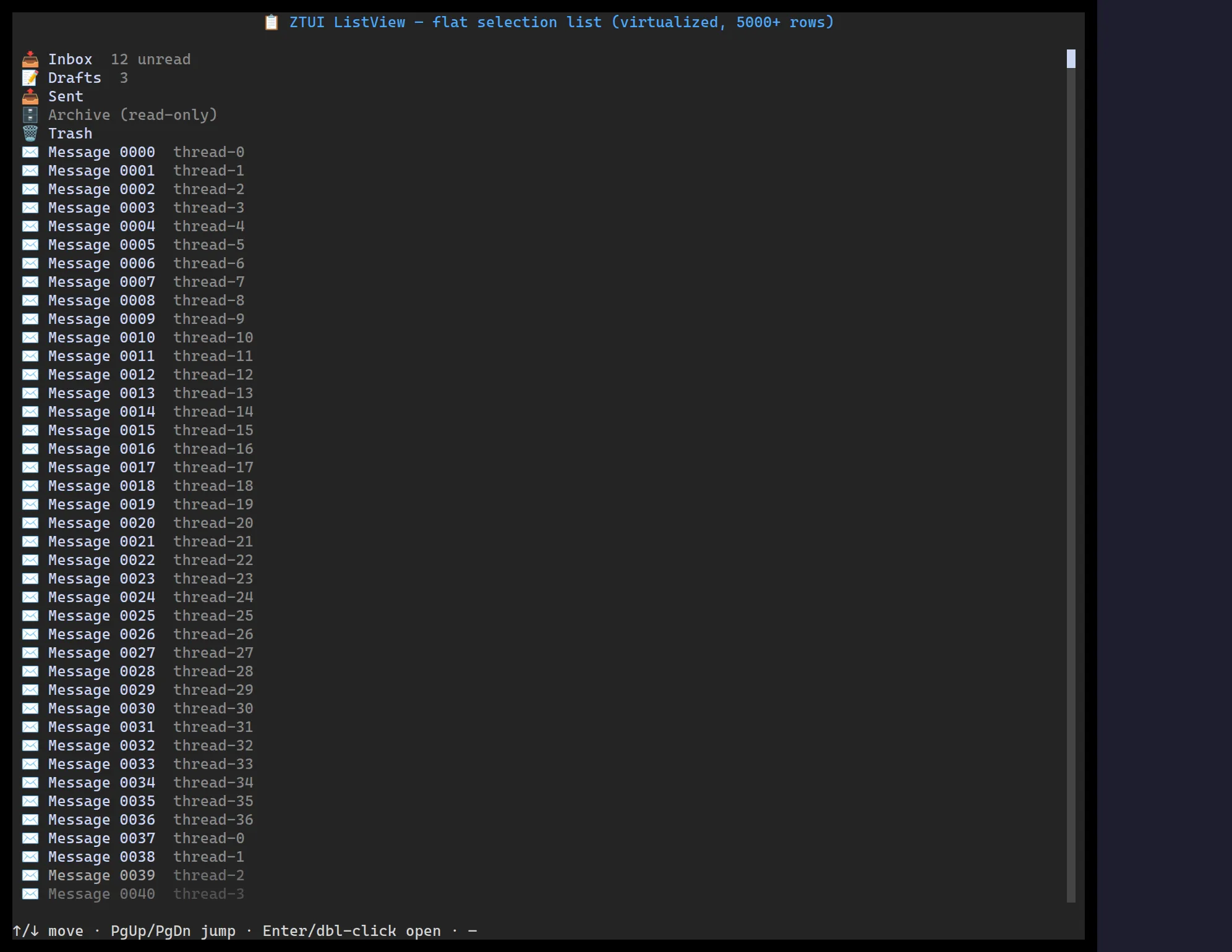
<ListView> is a virtualized single-column list — selection, scrolling, and
Enter-to-activate, with each item optionally carrying an icon and a muted detail.
import { ListView } from "@huyz0/ztui/react";
const items = [  { id: "inbox", label: "Inbox", icon: "inbox" },  { id: "sent", label: "Sent", icon: "paper-airplane" },  { id: "drafts", label: "Drafts", detail: "3" },];
<ListView  items={items}  selectedId="inbox"  onSelect={(item) => console.log("selected", item.id)}  onActivate={(item) => console.log("opened", item.id)}/>;
Key props
Section titled “Key props”items—ListItem[]({ id, label, icon?, detail? }).selectedId/onSelect— controlled selection.onActivate— fired onEnter/Space.selectedBackground/mutedColor— styling hooks.
Interaction
Section titled “Interaction”↑/↓ move · PgUp/PgDn/Home/End paginate · Enter/Space activates ·
click a row to select.
Grouping
Section titled “Grouping”Pass groups instead of items to render collapsible sections: each group is a
non-interactive title row (with an item count) followed by its items. The cursor
and clicks skip the titles; clicking a title — or ←/→ on a row in it —
collapses/expands the group.
<ListView groups={[ { id: "today", title: "Today", items: todayItems }, { id: "earlier", title: "Earlier", items: earlierItems, collapsed: true }, ]} onToggleGroup={(id, collapsed) => console.log(id, collapsed)}/>;Table takes the same groups prop (with row objects) for grouped grids.