
Chips & Pills
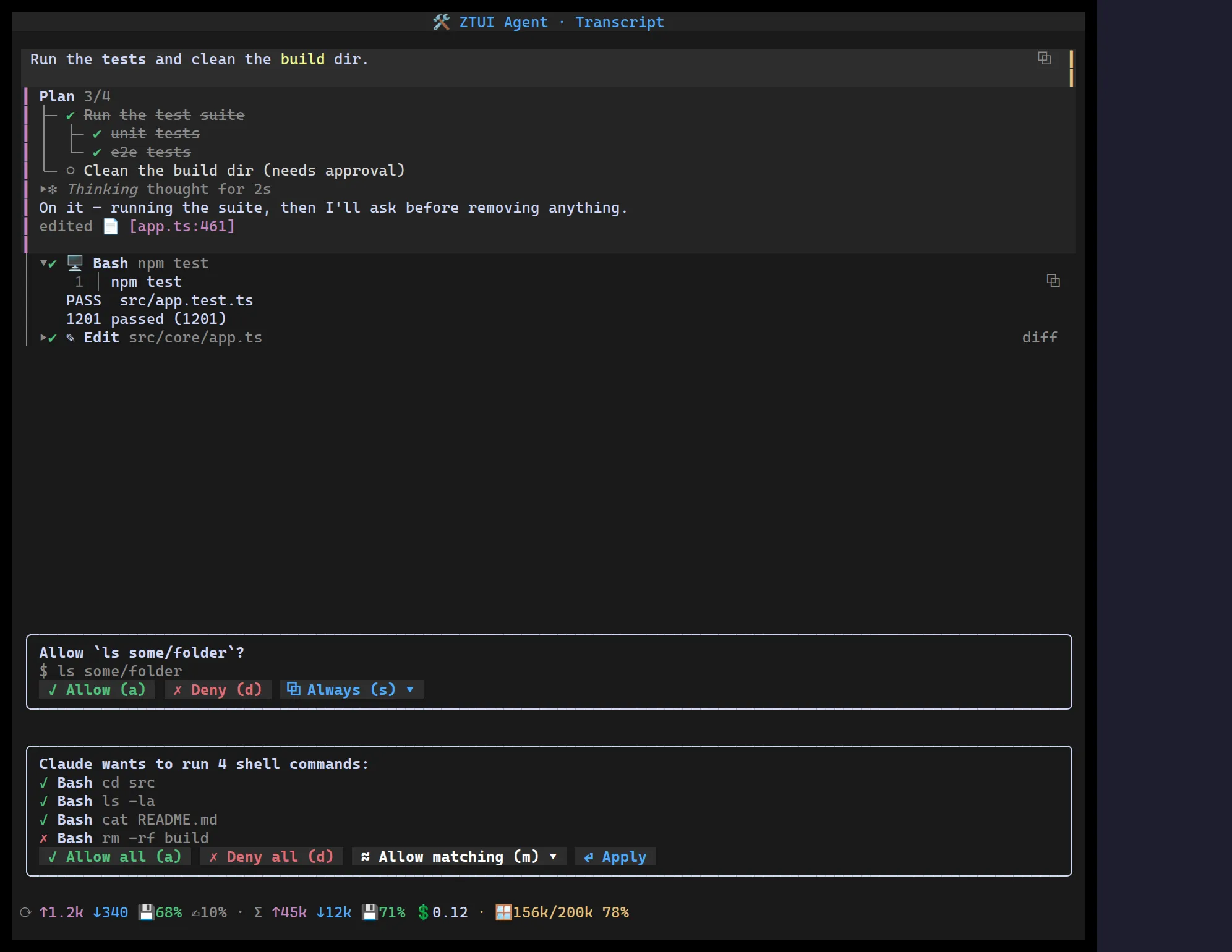
Small inline tokens for annotating agent output: <Chip> is a tag / mention /
attachment, <Pill> is a compact status dot, and <FileChip> is a clickable
file citation.
A small inline token. fill paints a solid colour block (terminal reverse video,
so the text always contrasts), bracket wraps the label in [ ], and dim is
muted text. Add an icon, make it clickable with onClick, or removable with
onRemove (a trailing ×).
import { Chip } from "@huyz0/ztui/react";
<Chip icon="📎" onRemove={() => drop(id)}>config.json</Chip><Chip variant="bracket" color="$success">passed</Chip>variant—"fill"(default),"bracket", or"dim".color— accent token (defaults to"$accent").icon/onClick/onRemove.
A compact status pill — a coloured ● dot and a label, for short states
(“running”, “queued”, “3 staged”). Lighter than a chip; no background.
import { Pill } from "@huyz0/ztui/react";
<Pill color="$success">ready</Pill>;
FileChip
Section titled “FileChip”A clickable file citation: shows basename:line and reports the full path back
through onOpen(path, line) so the host can open it in an editor.
import { FileChip } from "@huyz0/ztui/react";
<FileChip path="src/core/app.ts" line={461} onOpen={(p, l) => openInEditor(p, l)} />;