
Checkbox
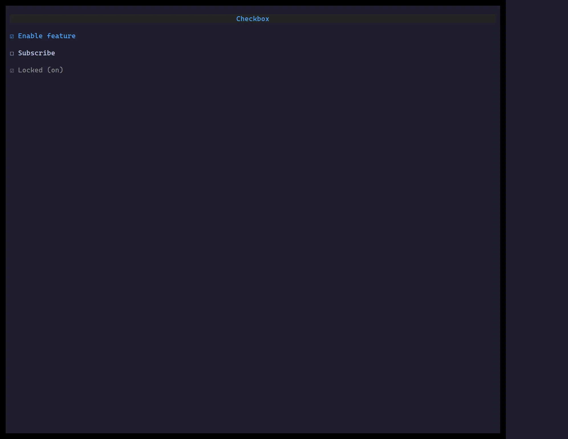
<Checkbox> toggles a boolean on Space/Enter or click, with an optional label.
import { useState } from "react";import { Checkbox } from "@huyz0/ztui/react";
function Toggle() {  const [on, setOn] = useState(false);  return <Checkbox checked={on} onChange={setOn} label="Enable feature" />;}
Key props
Section titled “Key props”checked/onChange— controlled boolean.label— text shown beside the box.disabled— inert + muted.validators/validateOn/onValidate— validation in a Form.