
Overlays
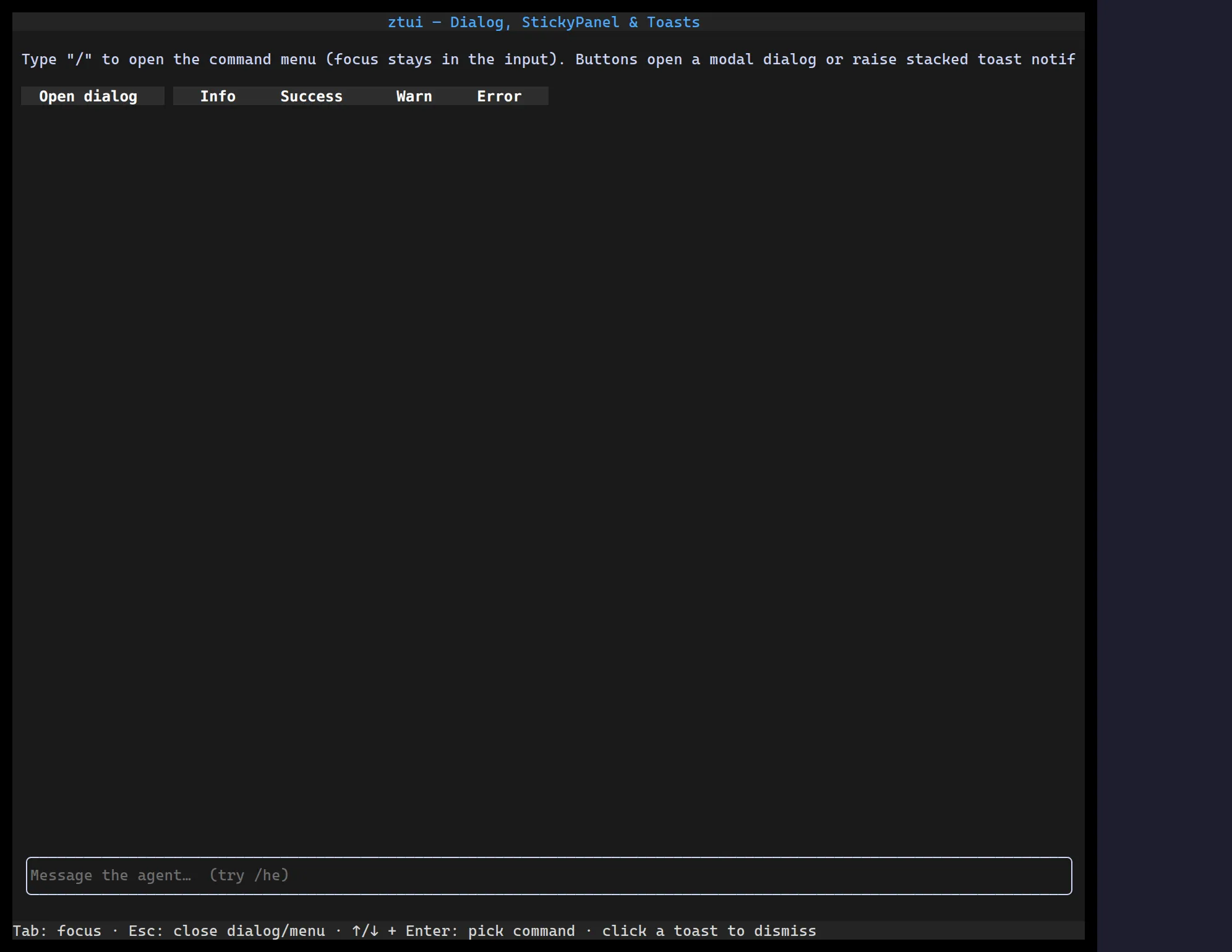
Overlays render on a layer above the main tree. <Dialog> is a focus-trapping
modal; <StickyPanel> is a non-modal popup (think slash-command menus, tooltips)
anchored near other content.
import { useState } from "react";import { Button, Dialog, Label } from "@huyz0/ztui/react";
function Confirm() {  const [open, setOpen] = useState(false);  return (    <>      <Button onClick={() => setOpen(true)}>Delete…</Button>      <Dialog open={open} onClose={() => setOpen(false)} closeOnEscape dim>        <Label>Are you sure?</Label>      </Dialog>    </>  );}
Key props (Dialog)
Section titled “Key props (Dialog)”open/onClose— visibility and close callback.closeOnEscape/closeOnOutsideClick— dismissal behavior.dim/dimFade— dim (and optionally fade) the backdrop.panelStyle— style the dialog panel.