
Tabs
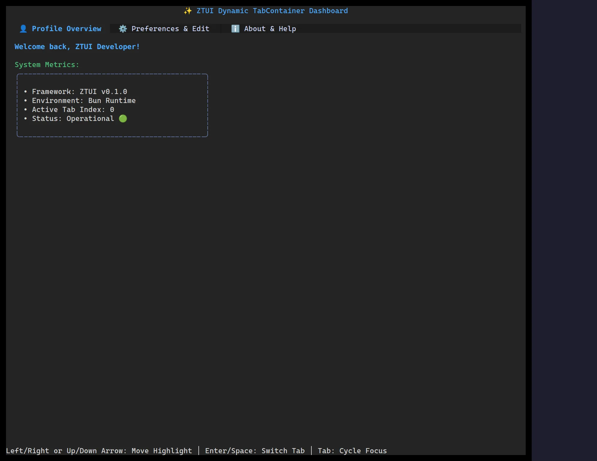
<TabContainer> shows a row of tabs and renders one child at a time. Each direct
child supplies its tab title via its label prop.
import { Label, TabContainer, VBox } from "@huyz0/ztui/react";
<TabContainer activeIndex={0} onChange={(i) => console.log("tab", i)}>  <VBox label="Profile" style={{ padding: 1 }}>    <Label>Profile panel</Label>  </VBox>  <VBox label="Preferences" style={{ padding: 1 }}>    <Label>Preferences panel</Label>  </VBox></TabContainer>;
Key props
Section titled “Key props”- Children — each child’s
labelbecomes its tab title. activeIndex/onChange— controlled active tab (or let it manage internally).reorderable— allow dragging a tab header to reorder tabs (defaultfalse).onReorder— fired once a drag-to-reorder ends at a new position; the headers already show the new order live during the drag, so reorder your own tab data here to match.
Interaction
Section titled “Interaction”Click a tab, or use the arrow keys when the tab bar is focused. With
reorderable, drag a tab header to move it.