
Chart
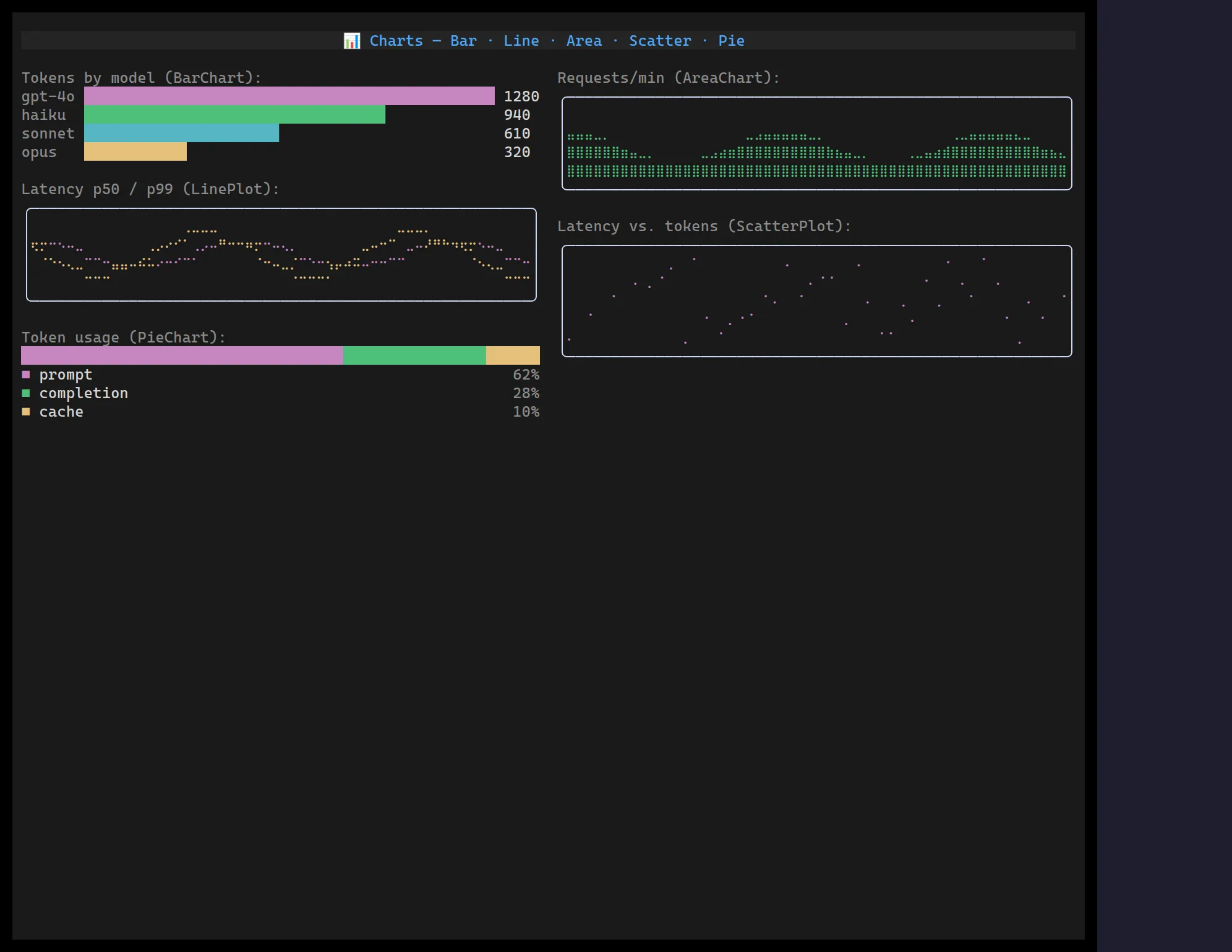
The chart family adds five compact data-viz widgets that sit above Sparkline when you need labels, multiple series, or more fidelity. All of them are constraint-resilient — they fill whatever box they’re given, down to a single cell, and tolerate empty/degenerate data without throwing or drawing out of bounds.
The three braille plots — LinePlot, ScatterPlot and
AreaChart — share one 2×4-dot surface, so a cols×rows box is a
(cols·2)×(rows·4) plotting grid.
BarChart
Section titled “BarChart”<BarChart> draws one horizontal bar per item for comparing labelled
magnitudes (top routes, model usage, error counts), with eighth-block sub-cell
precision.
import { BarChart } from "@huyz0/ztui/react";
<BarChart items={[ { label: "gpt-4o", value: 1280, color: "$accent" }, { label: "haiku", value: 940, color: "$success" }, { label: "opus", value: 320, color: "$warning" }, ]} style={{ width: 50, height: 4 }}/>;items—{ label?, value, color? }[].min/max— fix the scale (defaults0→ the largest value).showValue— print each value after its bar (dropped first when space is tight).
When the width tightens it sheds the value column, then truncates labels, always keeping at least the bar.
LinePlot
Section titled “LinePlot”<LinePlot> plots one or more numeric series as connected braille lines — each
cell is a 2×4 dot grid, so a cols×rows box yields a (cols·2)×(rows·4)
plotting surface.
import { LinePlot } from "@huyz0/ztui/react";
<LinePlot series={[latencyP50, latencyP99]} colors={["$accent", "$warning"]} min={0} max={100} style={{ border: "rounded", width: 60, height: 8 }}/>;data— a single series, orseries— multiplenumber[][].colors— per-series colours (cycles if shorter than the series count).min/max— fix the value range (defaults to the data’s own range).
It copes with empty, single-point, and flat series without dividing by zero or drawing out of bounds.
ScatterPlot
Section titled “ScatterPlot”<ScatterPlot> plots { x, y } points on the same braille surface but without
connecting lines — so unlike LinePlot the x position is meaningful, not just
the sample index. It suits correlations and clouds rather than ordered trends.
import { ScatterPlot } from "@huyz0/ztui/react";
<ScatterPlot points={[ { x: 1, y: 2 }, { x: 3, y: 5 }, { x: 4, y: 1 }, ]} style={{ border: "rounded", width: 40, height: 8 }}/>;points— a single series, orseries— multipleScatterPoint[][].colors— per-series colours (cycles if shorter than the series count).minX/maxX/minY/maxY— pin either axis (defaults to the data range).
AreaChart
Section titled “AreaChart”<AreaChart> is a LinePlot with the region below each series filled in, for
cumulative or volume-style trends. Series paint in order, so a later (typically
smaller) series draws over an earlier one — pass them largest-first when stacking
visually.
import { AreaChart } from "@huyz0/ztui/react";
<AreaChart data={requestsPerMinute} colors={["$success"]} min={0} max={100} style={{ border: "rounded", width: 60, height: 8 }}/>;data— a single series, orseries— multiplenumber[][].colors— per-series colours (cycles if shorter than the series count).min/max— fix the value range (defaults0→ the data maximum).
PieChart
Section titled “PieChart”<PieChart> shows a proportional breakdown as a single 100%-stacked horizontal
bar with a percentage legend beneath. It’s the terminal-friendly stand-in for a
pie chart — a real circle only gets coarse and ambiguous in cells, whereas a
stacked bar stays crisp at any width.
import { PieChart } from "@huyz0/ztui/react";
<PieChart items={[ { label: "prompt", value: 62, color: "$accent" }, { label: "completion", value: 28, color: "$success" }, { label: "cache", value: 10, color: "$warning" }, ]} style={{ width: 40 }}/>;items—{ label?, value, color? }[]; slices withvalue <= 0are dropped.showLegend— show the labelled percentage rows below the bar (defaulttrue).
Segment widths are allocated to sum exactly to the bar width (the largest fractional remainder absorbs rounding), so the bar always spans the full box.