
Collapsible
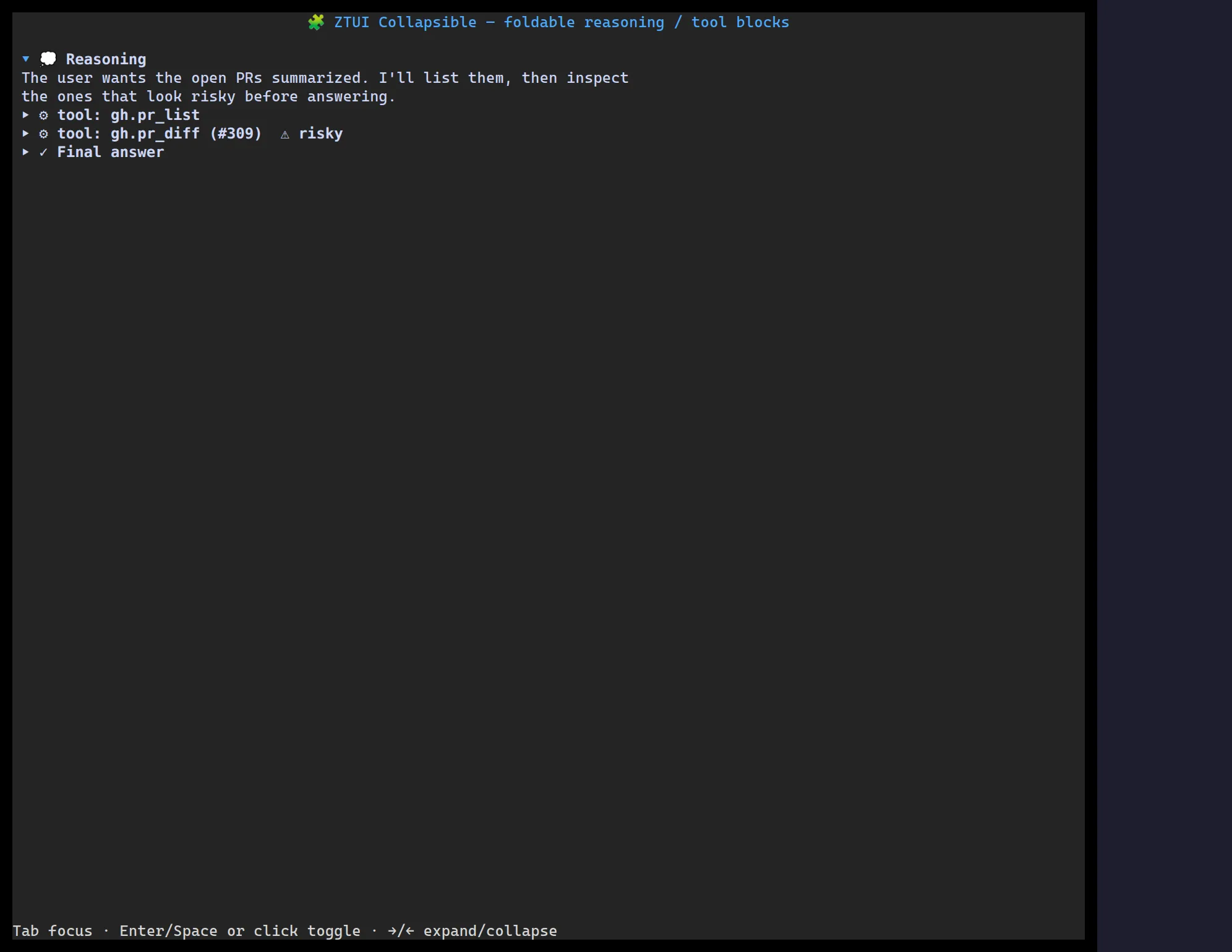
<Collapsible> is a titled disclosure: a clickable header with a chevron that
shows or hides its children. Controlled or uncontrolled.
import { Collapsible, Label } from "@huyz0/ztui/react";
<Collapsible title="Tool call" defaultOpen>  <Label>The body is revealed when the section is open.</Label></Collapsible>;
Key props
Section titled “Key props”title— the header text.open/defaultOpen— controlled or initial state.onToggle— fired with the new open state.glyphSet— customize the open/closed marker glyphs.