
Table
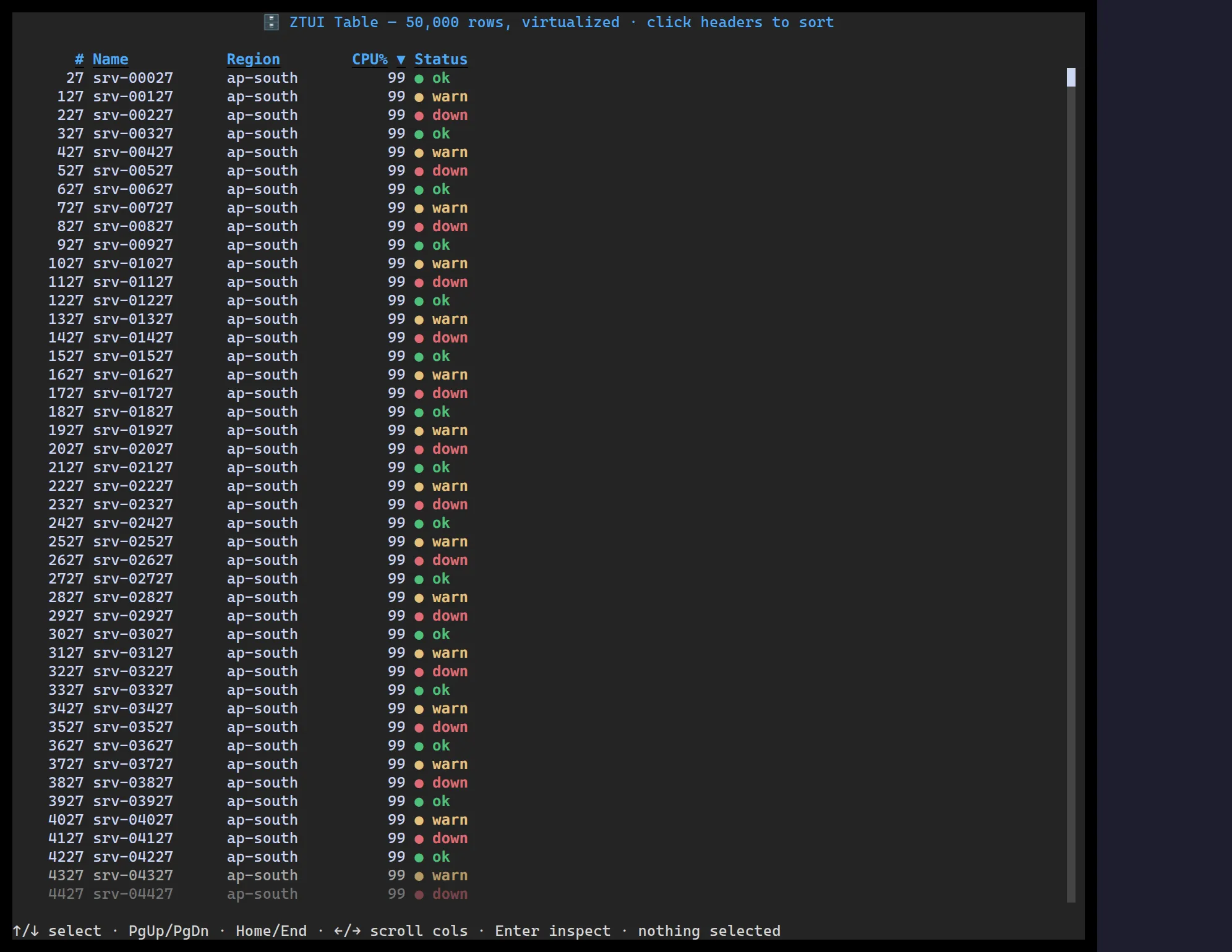
<Table> self-renders only the rows in the viewport, so per-frame work is bounded
regardless of dataset size. Columns size with fixed widths, <n>fr, or auto;
the header is pinned and sortable; cells can be plain text or nested widgets.
import { Table } from "@huyz0/ztui/react";
const rows = [  { id: 1, name: "srv-00027", region: "ap-south", cpu: 99, status: "ok" },  { id: 2, name: "srv-00127", region: "ap-south", cpu: 99, status: "warn" },];
<Table  data={rows}  columns={[    { key: "name", title: "Name", width: "1fr" },    { key: "region", title: "Region" },    { key: "cpu", title: "CPU %", width: 8 },    { key: "status", title: "Status", render: (r) => r.status },  ]}  onActivate={(row) => console.log("entered", row)}/>;
Key props
Section titled “Key props”data— the row array (left untouched; sorting reorders an index over it).columns—{ key, title, width?, render? }[].widthis a number,"<n>fr", or"auto".sort/onSortChange— controlled sort state, or let the header manage it.selectedIndex/onSelect/onActivate— selection and Enter-to-activate.
Interaction
Section titled “Interaction”↑/↓ move selection · PgUp/PgDn/Home/End paginate · click a header to
sort · Enter activates the selected row.
Grouping
Section titled “Grouping”Pass groups instead of data to split rows into collapsible sections, each
introduced by a non-interactive title row (with a count). The cursor skips the
titles; clicking a title collapses/expands its group, and onToggleGroup reports
the change. Grouped tables render text columns (no sorting or render cells).
<Table columns={columns} groups={[ { id: "anthropic", title: "Anthropic", items: anthropicRows }, { id: "openai", title: "OpenAI", items: openaiRows, collapsed: true }, ]}/>;