
Status
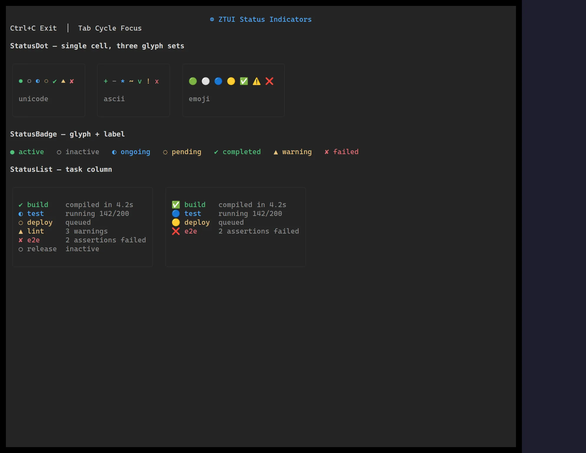
The status family renders a small set of states (ok, warn, error, info,
pending, …) as a colored dot, a labelled badge, or a list of items.
import { StatusBadge, StatusDot, StatusList } from "@huyz0/ztui/react";
<StatusDot state="ok" /><StatusBadge state="warn" label="Degraded" /><StatusList  items={[    { state: "ok", label: "API", detail: "142ms" },    { state: "error", label: "Worker", detail: "timeout" },  ]}/>;
Key props
Section titled “Key props”state— the status key driving the glyph and color.label(badge) /items(list) — text content.glyphSet— swap the per-state glyphs.