
Gallery View
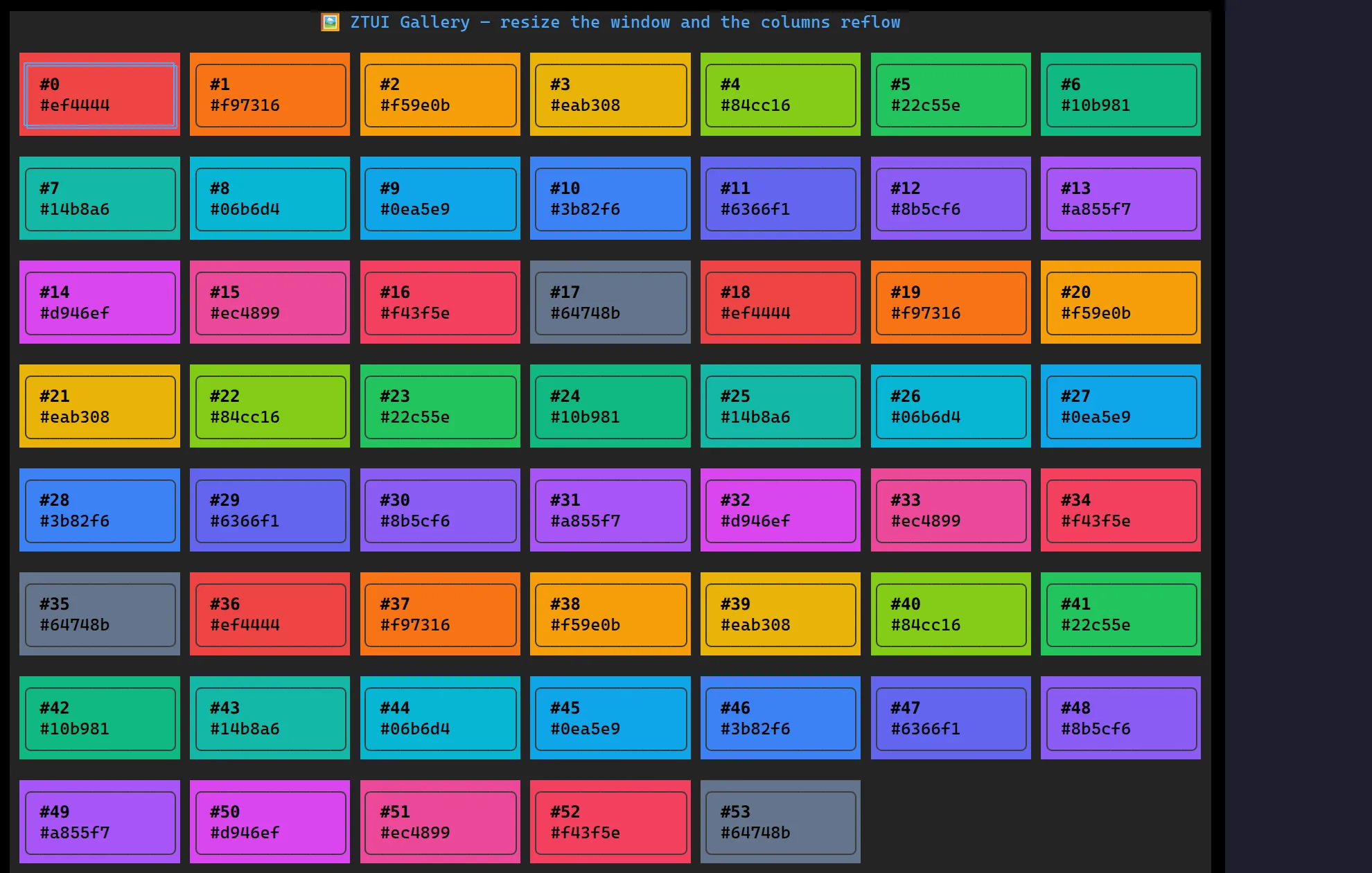
<GalleryView> lays arbitrary items out as a grid whose column count flows
from the container width — resize the terminal and it reflows. Arrows move a
2D cursor, the wheel and scrollbar scroll the overflow, and you render each cell
yourself with renderItem. It’s the building block behind card pickers (themes,
files, images, emoji).
import { GalleryView } from "@huyz0/ztui/react";
const swatches = palette.map((color, id) => ({ id, color }));
<GalleryView  items={swatches}  itemWidth={16}  itemHeight={4}  onSelect={(index) => setCursor(index)}  onActivate={(index) => choose(swatches[index])}  renderItem={(item, { selected }) => (    <VBox      style={{        width: "100%",        height: "100%",        border: selected ? "double" : "rounded",        background: item.color,      }}    >      <Label style={{ color: "#000" }}>{` #${item.id}`}</Label>    </VBox>  )}/>;
Key props
Section titled “Key props”items/renderItem— the data and a(item, { index, selected }) => noderenderer. Highlighting the selected cell is up torenderItem.itemWidth/itemHeight— fixed cell size in cells;itemWidthis the basis for the auto column count.columns— fix the column count instead of deriving it from the width.gap— spacing between cells on both axes (default 1).selectedIndex/defaultSelectedIndex— controlled or uncontrolled cursor.onSelect(index)/onActivate(index)— cursor moved, and Enter/Space or double-click.
The host element needs a bounded height (via style) so the grid can scroll.
Interaction
Section titled “Interaction”←/→ move within a row · ↑/↓ move across rows · PgUp/PgDn/Home/End
jump · Enter/Space activates · the mouse wheel and scrollbar scroll ·
click a cell to select (double-click activates). The selected cell is always
scrolled into view, and the columns re-flow when the terminal resizes.