
Input
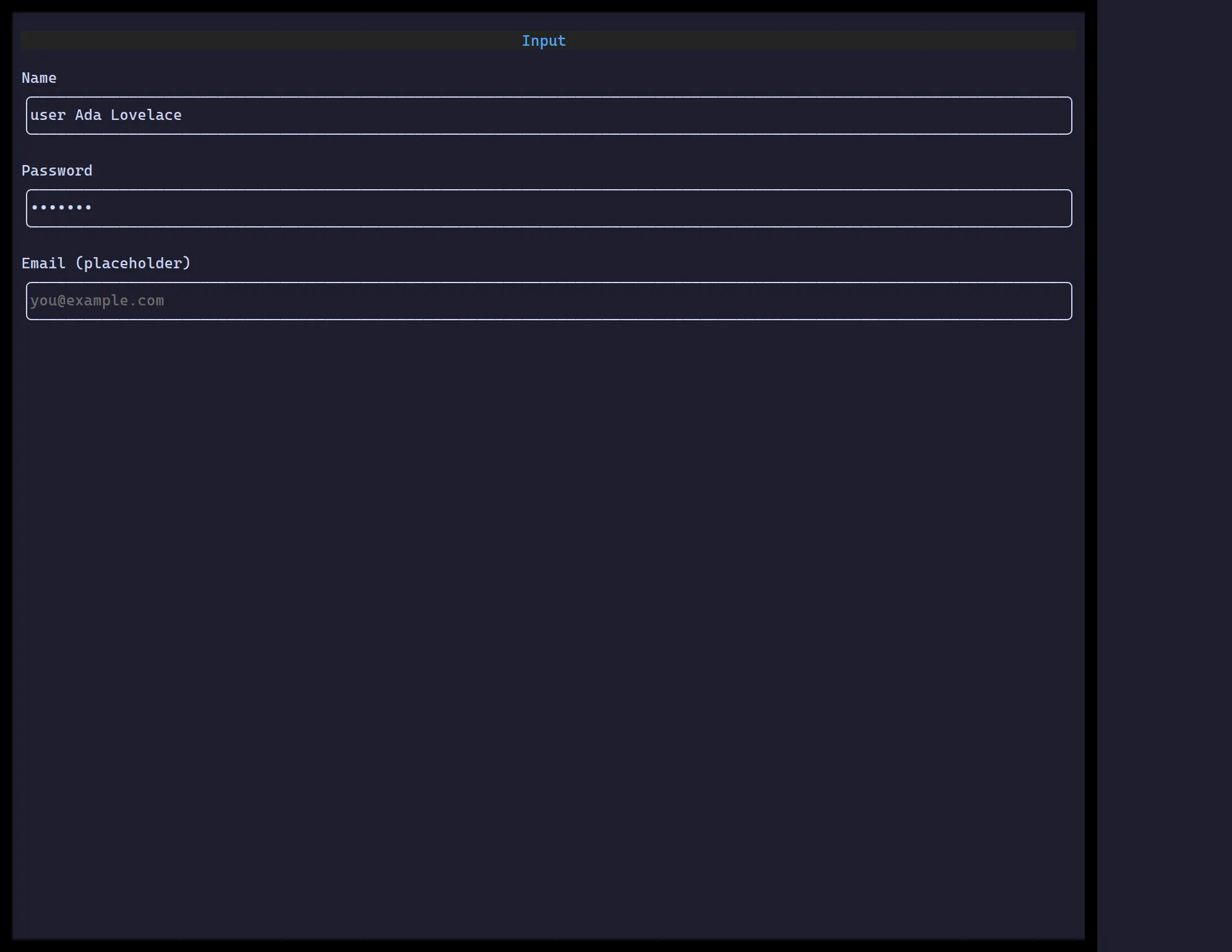
<Input> is a single-line editor: caret movement, selection, clipboard, an
optional leading/trailing icon, password masking, and form validation.
import { useState } from "react";import { Input } from "@huyz0/ztui/react";
function NameField() {  const [name, setName] = useState("");  return <Input value={name} onChange={setName} icon="user" placeholder="Your name" />;}
Key props
Section titled “Key props”value/onChange— controlled text.type—"text"|"password"|"email".icon/suffixIcon— leading/trailing glyphs.placeholder— shown when empty.validators/validateOn/onValidate·invalid— validation hooks.