
Banner
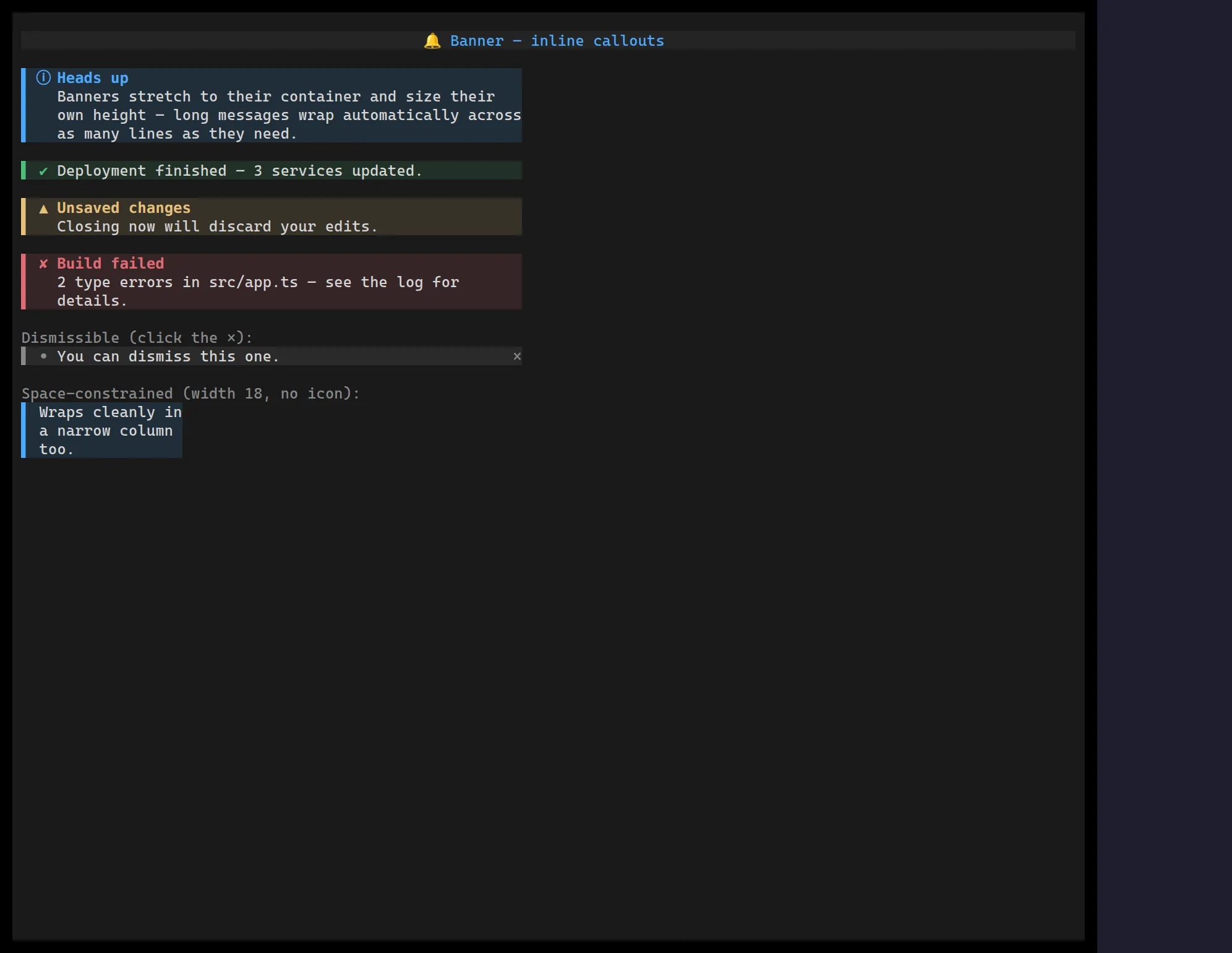
<Banner> is an inline callout — an accent rule, a variant icon, an optional
bold title and a word-wrapped message — for surfacing a state the user should
notice without it stealing focus or auto-dismissing like a toast. Five semantic
variants drive the icon and a theme-resolved accent together.
It stretches to its container width and sizes its own height from the wrapped message, so it drops naturally into a column.
import { Banner } from "@huyz0/ztui/react";
<Banner  variant="warning"  title="Unsaved changes"  message="Closing now will discard your edits."/>;
// Dismissible<Banner variant="success" message="Deployed." dismissible onDismiss={hide} />;
Key props
Section titled “Key props”variant—"info" | "success" | "warning" | "error" | "neutral"(defaultinfo); sets the icon and accent.title— optional bold heading on the first line.message— body text; word-wraps to the available width.glyphSet—"unicode" | "ascii" | "emoji"icon vocabulary.showIcon/fill— toggle the leading icon and the tinted background (both defaulttrue).dismissible+onDismiss— draw a clickable×and fire on click.
The same callout look is produced automatically for GitHub-Flavored Markdown
alerts (> [!NOTE], > [!WARNING], …).