
Theming
A theme is a named set of semantic colors. Widgets reference those colors by
token ($primary, $surface, …) rather than literal hex, so one widget tree
re-colors itself completely when the active theme changes — no per-widget edits.
Tokens
Section titled “Tokens”Use these in any color / background (and anywhere a style value is a string,
via $name or var(--name) — see Styling):
| Token | Role |
|---|---|
$background | app backdrop |
$foreground | default text |
$surface | raised surface (cards, panels) |
$panel | a second elevation above surface |
$primary | primary accent / interactive |
$secondary | secondary accent |
$accent | tertiary accent / highlights |
$success | positive state |
$warning | caution state |
$error | error / destructive state |
$border | border lines |
$dimmed | de-emphasized text |
Syntax-highlighting tokens ($keyword, $string, $number, $comment, …) and
UI accents ($focus, $selectionBg) are also defined; the Markdown
and Diff widgets use them automatically.
Built-in themes
Section titled “Built-in themes”ztui ships a large set of popular palettes, including default-dark (the
default) and default-light, plus catppuccin-mocha / -macchiato / -frappe
/ -latte, nord, dracula, gruvbox-dark / -light, tokyo-night,
one-dark, rose-pine, monokai, everforest, solarized-dark / -light,
cobalt2, poimandres, kanagawa, github-dark, horizon, and nightfly.
List them at runtime:
import { ThemeManager } from "@huyz0/ztui";
const tm = ThemeManager.getInstance();tm.listThemes().map((t) => t.name);
Switching the active theme
Section titled “Switching the active theme”import { ThemeManager } from "@huyz0/ztui";
ThemeManager.getInstance().setTheme("tokyo-night");The app subscribes to theme changes and re-renders the whole tree, so every
$token updates live. (An unknown name is ignored with a warning.)
The theme picker
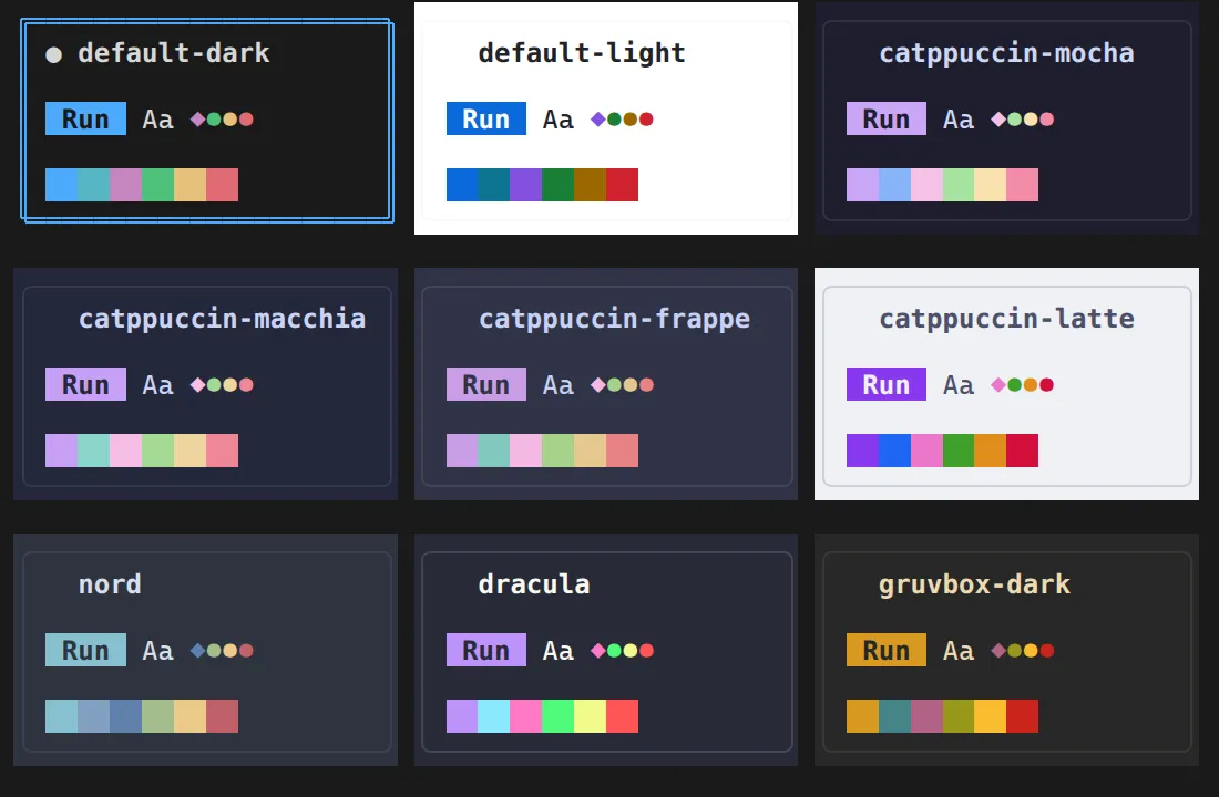
Section titled “The theme picker”Mount <ThemePalette> once near your app root and press Ctrl+T for a
built-in visual picker. It lays every registered theme out as a card painted in
its own colors — the palette swatches plus a tiny live example (a button, body
text, and status dots) — so you can compare them at a glance:
import { ThemePalette } from "@huyz0/ztui/react";
<Dock> <ThemePalette /> {/* Ctrl+T; override with toggleKey="…" */} …</Dock>;- Browse with the arrows, or scroll/drag the grid with the mouse — the card you land on previews live across the whole app.
- Enter or click applies a theme but keeps the picker open, so you can see it in context before committing.
- Esc closes — keeping a theme you applied, or reverting an un-committed preview back to the one you opened with.
Persisting the choice
Section titled “Persisting the choice”Bind it like a controlled input: pass the saved theme name in as value, and
write the chosen one back from onSelect (to localStorage, a config file, …).
const [theme, setTheme] = useState(() => loadSavedTheme() ?? "default-dark");
<ThemePalette  value={theme}  onSelect={(t) => {    setTheme(t.name);    saveTheme(t.name);  }}/>;
Per-subtree themes
Section titled “Per-subtree themes”Set the theme prop on any widget to re-theme just that subtree — handy for a
preview pane or a callout in a different palette. Tokens in descendants resolve
against the nearest ancestor theme:
<VBox theme="dracula"> <Label style={{ color: "$primary" }}>themed independently of the app</Label></VBox>Registering a custom theme
Section titled “Registering a custom theme”Register a Theme (just a name and a colors map) and switch to it:
import { ThemeManager } from "@huyz0/ztui";
const tm = ThemeManager.getInstance();tm.register({  name: "brand",  colors: {    primary: "#7c5cff",    secondary: "#22d3ee",    background: "#0b0b12",    foreground: "#e7e7ef",    surface: "#15151f",    panel: "#1d1d2a",    accent: "#f0abfc",    success: "#34d399",    warning: "#fbbf24",    error: "#fb7185",    border: "#2a2a3a",  },});tm.setTheme("brand");
Only the core tokens are required; anything you omit falls back sensibly. To
spin a variant off an existing palette, use deriveTheme:
import { deriveTheme, ThemeManager } from "@huyz0/ztui";
const tm = ThemeManager.getInstance();const dimmer = deriveTheme(tm.getTheme("nord")!, "nord-dim", { adjustLightness: -8 });tm.register(dimmer);
NO_COLOR
Section titled “NO_COLOR”ztui honours the NO_COLOR convention. When NO_COLOR
(any value) or ZTUI_NO_COLOR is set in the environment, the terminal renderer
drops all foreground/background colour and emits only the monochrome attributes
(bold, dim, italic, underline, strikethrough, reverse) plus hyperlinks;
FORCE_COLOR overrides back to colour.
You can also toggle it at runtime via the global colorMode flag — call
App.refresh() afterwards so the next frame re-emits every cell:
import { App, colorMode } from "@huyz0/ztui";
colorMode.set(false); // monochromeApp.instance?.refresh();
This mirrors the motion flag (which honours NO_MOTION / ZTUI_REDUCED_MOTION
to settle ambient animations).