
Date Picker
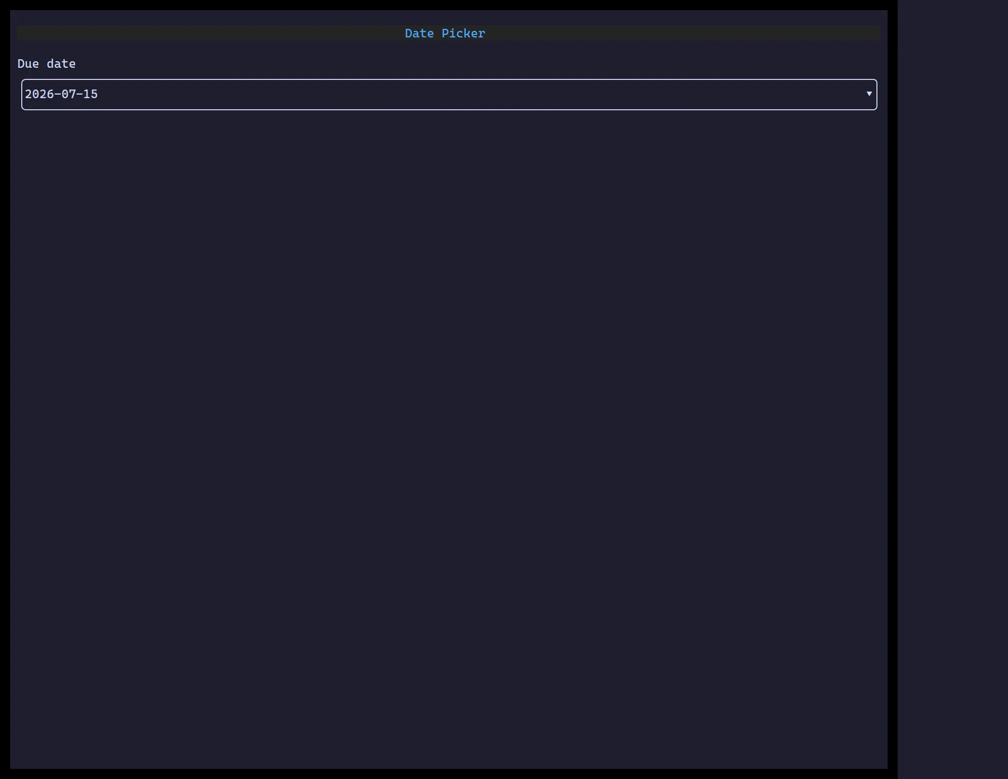
<DatePicker> is a single-date field — activate it (click, Enter, or Space)
to open a calendar popover, navigate by day/month/year, and commit a pick.
The value is always a plain YYYY-MM-DD string.
import { useState } from "react";import { DatePicker } from "@huyz0/ztui/react";
function DueDate() {  const [date, setDate] = useState("");  return <DatePicker value={date} onChange={setDate} placeholder="Pick a date…" />;}
Key props
Section titled “Key props”value— selected date asYYYY-MM-DD, or""/omitted for no selection.onChange— called with the newYYYY-MM-DDvalue when a day is committed.placeholder— shown when nothing is selected.
Interaction
Section titled “Interaction”Enter/Space/click opens the calendar popover · arrow keys move the focused
day · PageUp/PageDown step months · Enter commits the focused day ·
Escape closes without committing.