
Combobox
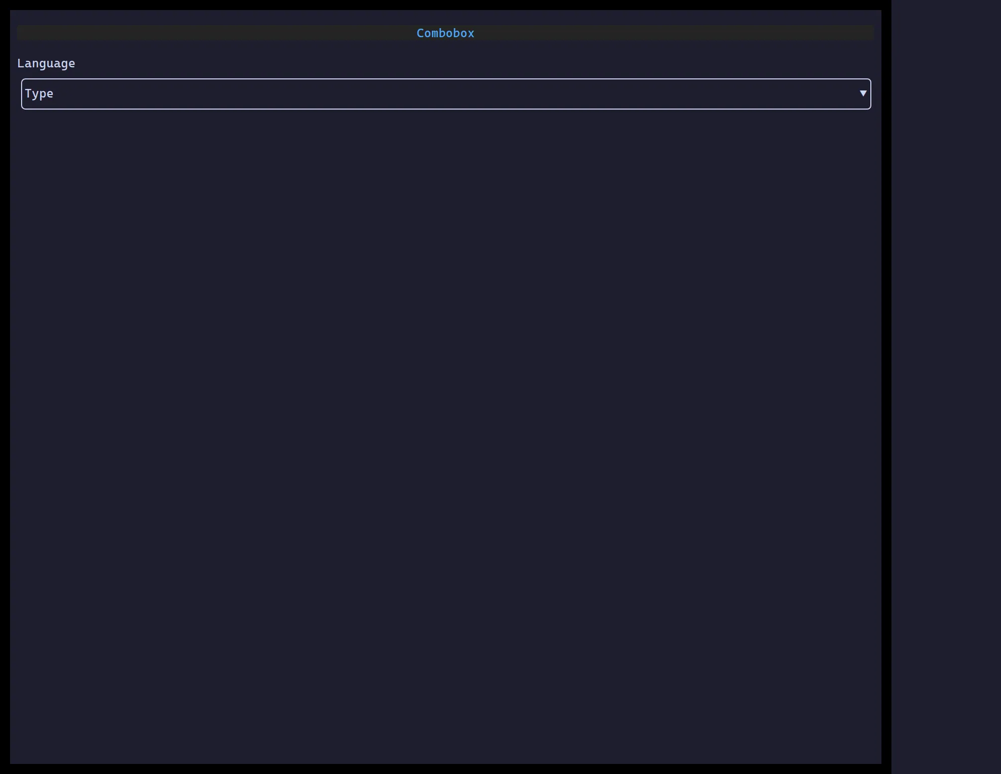
<Combobox> is a text field that narrows options to matches as you type,
showing suggestions in a popover — pick one, or keep typing a custom value.
import { useState } from "react";import { Combobox } from "@huyz0/ztui/react";
function LangPicker() {  const [lang, setLang] = useState("");  return (    <Combobox      options={["TypeScript", "Rust", "Go", "Python"]}      value={lang}      onChange={setLang}      placeholder="Type to filter…"    />  );}
Key props
Section titled “Key props”options—(string | { value, label })[].value/onChange— the current text, updated on every edit and pick.onSelect— fired specifically when a suggestion is picked (click or Enter).placeholder— shown when the field is empty.allowCustomValue— keep text matching no option as-is when the popover closes (defaulttrue); setfalseto require picking a listed option.
Interaction
Section titled “Interaction”Typing filters and opens the popover · ↑/↓ move the highlighted suggestion
· Enter picks it · Escape closes without picking · click a suggestion to
pick it.